
Tutorial: Animating heatmap overlay-ed into Philippine map.
This is my third post on my Tutorial series. This time, we will do something geospatial and close to my heart, mapping the Philippines!
To do this in Python, we will be using coordinate mapping to establish boundaries. I am biased for matplotlib so it is all that we need for this tutorial, no seaborn, no bokeh and definitely no geopandas.
First, we need to find the coordinates of our Map. I used Google maps to identify latitude and longitude of a polygon that would cover the entire Philippines.
I set the origin of the map as (lat = 11.9, lon = 122.5). For polygon mapping, you only need two points to define an area. These coordinates are:
Lower left coordinate: llcrnrlon = 117, llcrnrlat = 5 Upper right coordinate: urcrnrlon = 127, urcrnrlat = 19
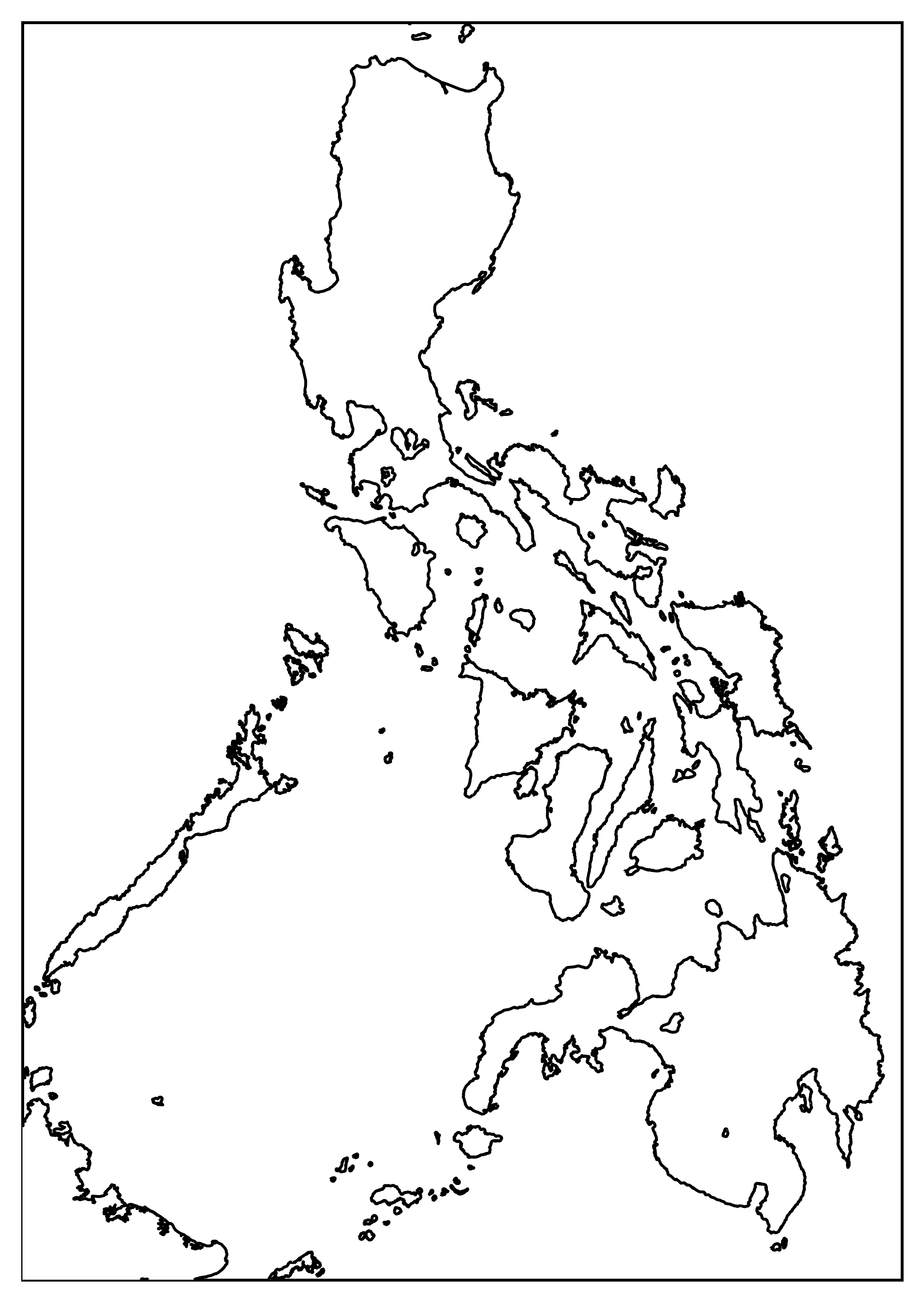
Here us the code to define the basemap in python.
And here is the blank map result:
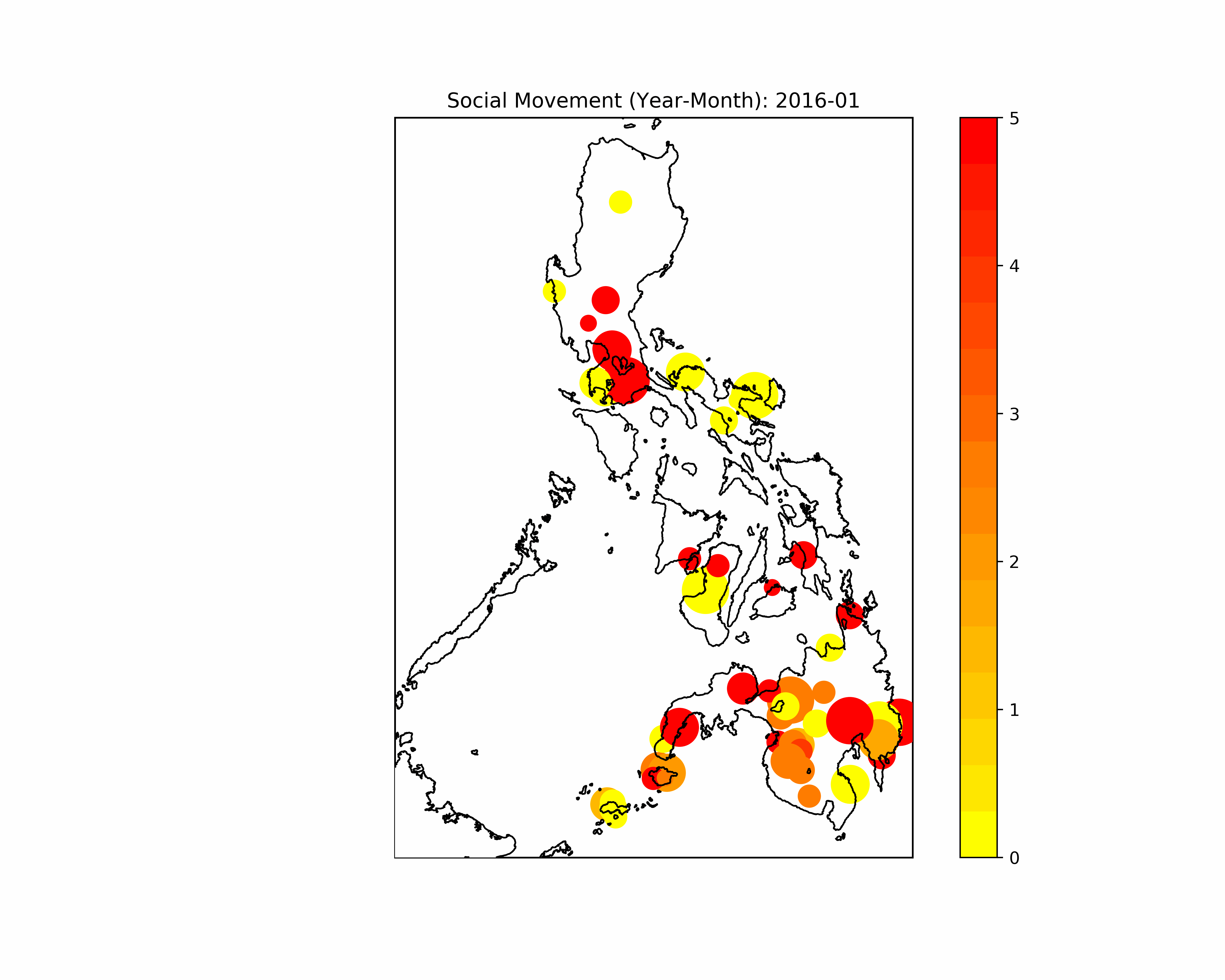
The next thing that we need is data. Since I am an activist, I am interested to visualize armed conflict in the Philippines. Luckily, a non-profit provides the data set.
The Armed Conflict Location & Event Data Project (ACLED) is a disaggregated data collection, analysis and crisis mapping project. ACLED records the dates, actors, types of violence, locations, and fatalities of all reported political violence and protest events across Africa, South Asia, Southeast Asia, the Middle East, Europe, and Latin America. Political violence and protest activity includes events that occur within civil wars and periods of instability, public demonstrations, and regime breakdown. ACLED’s aim is to capture the forms, actors, dates, and locations of political violence and protest as it occurs across states. The ACLED team conducts analysis to describe, explore and test conflict scenarios, and makes both data and analysis open to freely use by the public.[ACLED](https://www.acleddata.com/about-acled/)
The Armed Conflict Location & Event Data Project (ACLED) is a disaggregated conflict analysis and crisis mapping project. ACLED is the highest quality, most widely used, real-time data and analysis source on political violence and protest around the world. Practitioners, researchers, and governments depend on ACLED for the latest reliable information on current conflict and disorder patterns.
I obtained data from 2016 to 2019 and aggregated the data per month by resampling. Here is my code:
The next part is making it animated. This is the code:
Here is the final output of the code.
Want to collaborate? Message me in LinkedIn.